Visual product analytics you can actually see
See metrics where they happen on live product screens and journeys not disconnected dashboards.

Loved by product-obsessed teams


Product analytics
made simple
Watch where users click, fork, and drop off on real screens. Spot what to optimize instantly.
CONVERSION
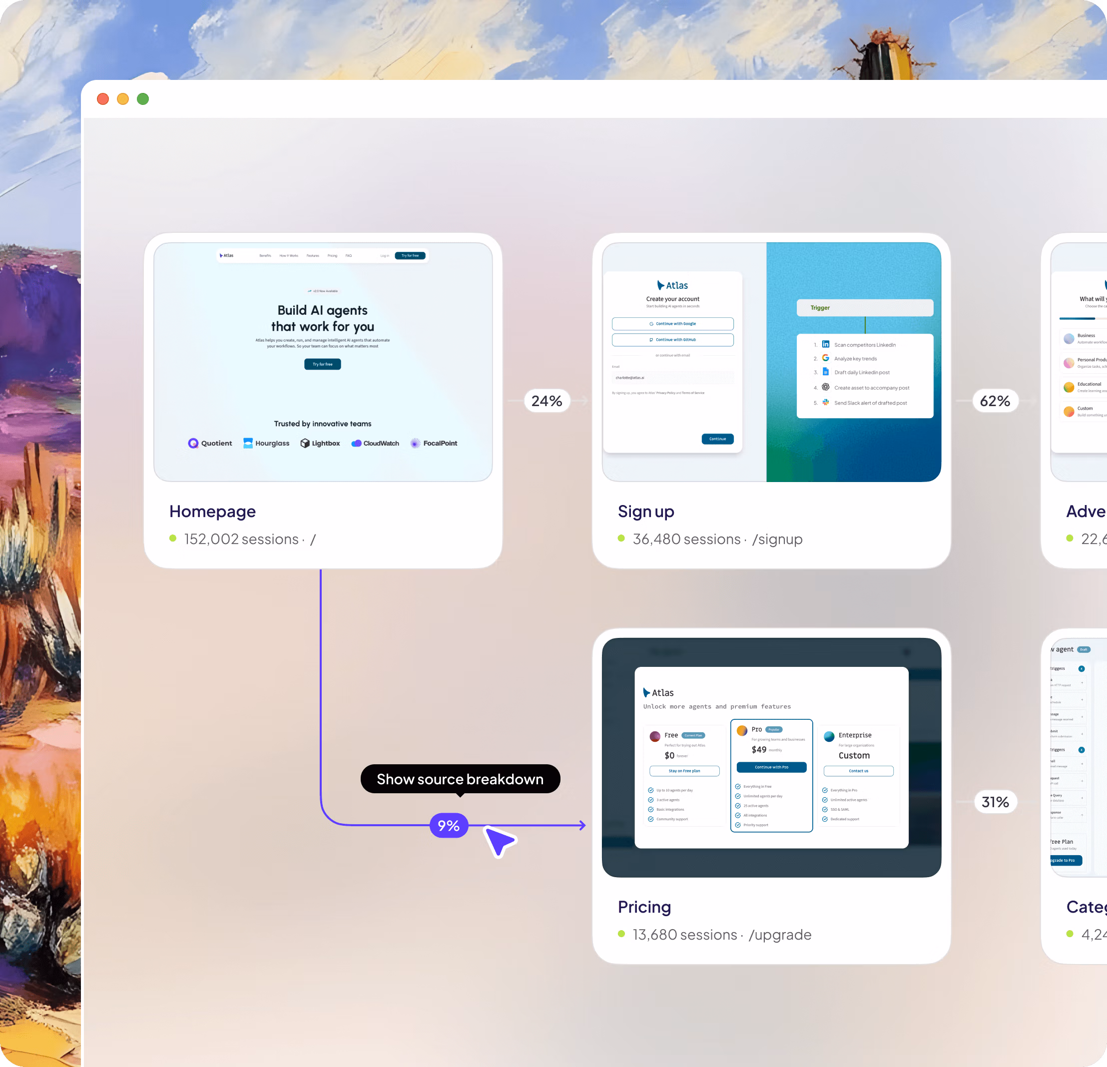
Journey analytics
Follow users from first click to conversion. Spot drop-offs instantly and turn insights into improvements that drive growth.
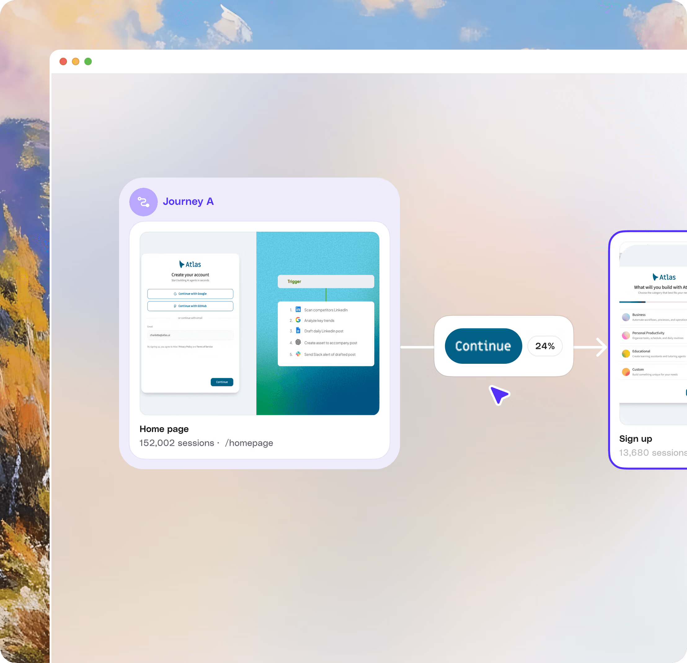
ACTIONS
Track every button
Visualize clicks with contextual insights. See which buttons users engage with, filter by interactions, watch replays, and build journeys seamlessly.
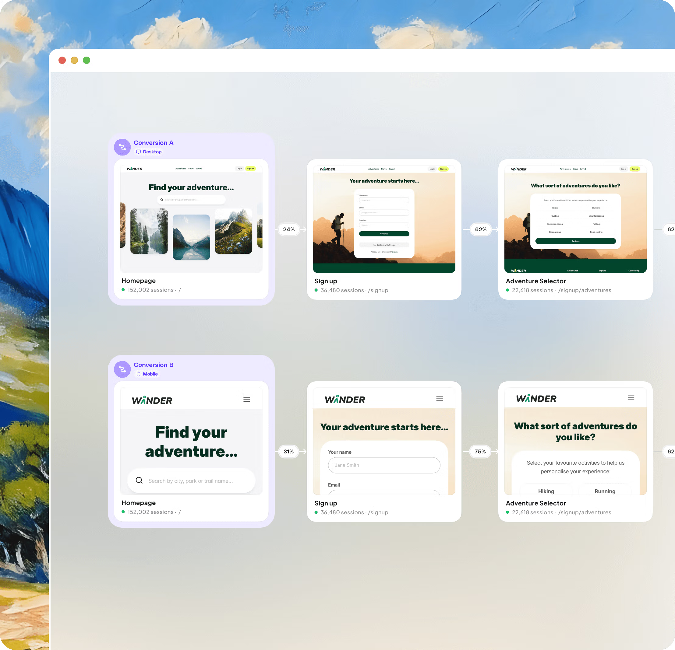
COMPARE
Compare journeys side-by-side
Map and compare multiple journeys on an infinite-canvas whiteboard. Visualize where they differ, spot drop-offs, and optimize conversions.
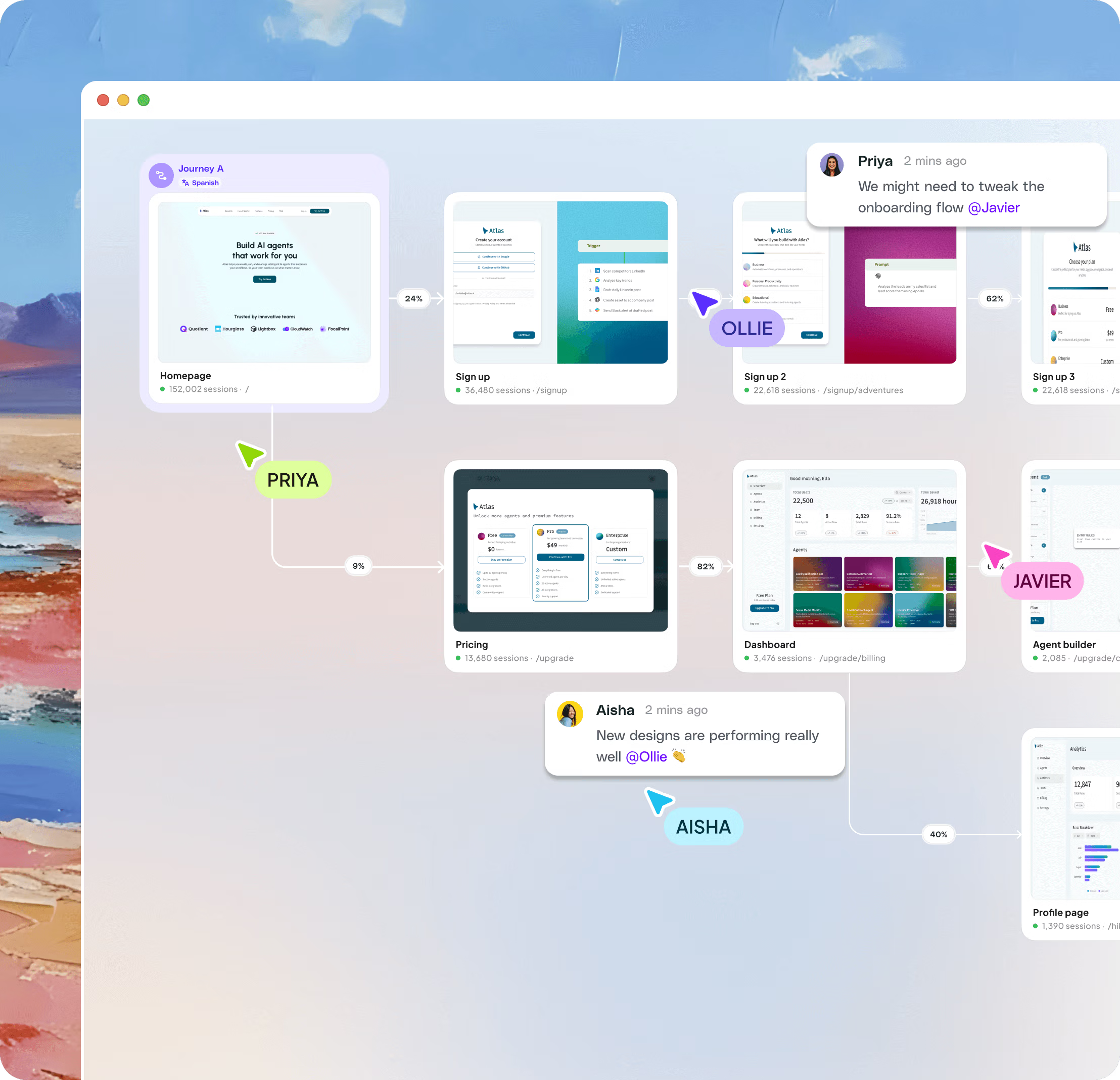
FOR ALL
Rally your team
Share product discoveries across your entire team without the complexity. Whether you're in product, design, or support, everyone sees the same picture.
All your product's
variations
Build with all your product states in mind—from the high-fives to the head-scratchers.
Sign into your account
or create a new account in minutes
 priya@gmail.com
Create new account
Use phone number instead


It's like X-ray vision goggles for your product. And it's X-ray vision goggles that anybody in your company can wear and they'll be able to figure it out right away. And you're going to give everybody in your company superpowers when you give them access to Adora.

ADORA PLATFORM
Insights to action
Unlock your product experience with journey maps, AI insights and a product design library, in one place.


HOW IT WORKS
How visual product analytics works
1. Install once — Add Adora's JavaScript snippet to your product. Adora automatically begins tracking every screen and interaction — no manual event tagging, no analytics configuration required.
2. Every screen is tracked automatically — Adora captures engagement data at the screen level: what users click, where they spend time, what they ignore, and where they drop off. You see your product through your users' eyes, not through a spreadsheet.
3. Identify problems and opportunities visually — Browse your product screen by screen to spot friction, confusion, and high-value moments. Click through to session replays for any screen to see exactly what happened. Share visual reports with your team without needing to build dashboards.
Frequently Asked Questions
Visual product analytics shows your metrics directly on real screenshots of your product — not in disconnected charts and dashboards. Instead of seeing '32% drop-off at step 3', you see the exact screen where users dropped off, with the metric overlaid on it. Adora captures every screen and interaction automatically, then layers analytics on top so your whole team can understand the data without needing to decode event names or dashboard configurations.
Google Analytics and Mixpanel show metrics as abstract numbers and charts — you have to mentally map data back to your actual product UI. Adora shows metrics where they happen: on the real screens and journeys in your product. There's also no manual event tagging required. Adora automatically captures every screen and action, so you get full product coverage from day one rather than only tracking the events your team remembered to instrument.
No. Adora automatically captures every screen, interaction, and navigation event in your product without any manual instrumentation. Most analytics tools require engineers to manually add tracking code for every button and screen — meaning you only see data for things you anticipated. Adora gives you complete coverage automatically, including screens and interactions that were never explicitly tracked.
Adora overlays interaction analytics directly on your product screenshots — showing click rates, drop-off rates, rage clicks, session counts, and conversion metrics at the screen and element level. You can follow conversion funnels from the first click through to completion, compare journeys side-by-side on a shared canvas, and filter all metrics by user segment, device, language, or date range.
Adora complements your existing analytics stack rather than replacing it. Where tools like Mixpanel or Amplitude excel at event-level metrics and data exports, Adora provides the visual product context that makes those numbers interpretable. Many teams use Adora alongside their existing analytics tools — Adora answers the 'where and why' questions that dashboards can't.
Adora's lightweight snippet records every screen, action, and session in your product in real time. It groups screens by URL and automatically detects variations — different languages, device sizes, A/B test variants, and user cohorts. No manual screen definitions or event tags are needed. As your product evolves and new screens are added, Adora captures them automatically.
Visual analytics is built to be accessible across the whole product team. Product managers use it to identify friction and prioritise fixes without waiting for data team support. Designers use it to validate design decisions against real usage patterns. Engineers use it to debug regressions by comparing screen behaviour before and after releases. Support teams use it to understand user-reported issues in product context.
Adora lets you compare journeys and screens side-by-side across cohorts — making it easy to see the full product impact of an A/B test, not just the conversion headline. You can view variant A and variant B on the same canvas, see how users navigated differently, and spot secondary effects like variant B improving checkout but increasing support contacts on the next screen.
Visual product analytics shows your product metrics directly on real screenshots of your product — not in disconnected charts and dashboards. Instead of seeing abstract numbers like '32% drop-off at step 3', you see the exact screen where users dropped off with the metric overlaid on it. Adora captures every screen and interaction automatically, then layers analytics on top, so your entire team can understand product performance without needing to decode event names or build custom dashboard queries.