Product Metrics Framework: Visual and Journey Intelligence for Product Teams
A product metrics framework that pairs classic measures (HEART, AARRR, North Star) with journey-level evidence, so your numbers tell you not just what's happening but why.


Every product team tracks dozens of numbers. Daily active users. Activation rate. Feature adoption. Retention. NPS. Churn. Revenue. By the end of a Monday dashboard review, most people in the room have a vague sense things are fine, a vague sense some numbers are down, and no clear answer about what to do next.
A good product metrics framework fixes that. Not by adding more metrics. By picking the right small set, organising them so they tell a story, and pairing each number with the journey evidence that explains why it's moving.
This guide walks through the classic metric frameworks worth knowing, where each one fits, and how to layer journey intelligence on top so your team ends the dashboard review with a decision instead of a shrug.
Why most metric dashboards fail
The problem with dashboards isn't the numbers. It's the gap between the number and the action.
Your activation rate dropped 3 points this week. Fine. What do you do about it? You can't act on "activation is down." You can act on "users in cohort X dropped off at step 3 of setup, and sessions show them hitting a broken validation error." That's a sentence. It's also the thing that dashboards almost never give you.
Pendo's 2019 Feature Adoption Report found that 80% of features in the average software product are rarely or never used. If you're only watching top-line metrics, most of the activity in your product is invisible to you. The feature you just shipped? Probably not in the 20% that gets touched. You'd never know unless the framework made it visible.
The fix is twofold. Pick a small number of outcome-level metrics that actually matter. Then go one layer deeper with journey data that explains them.
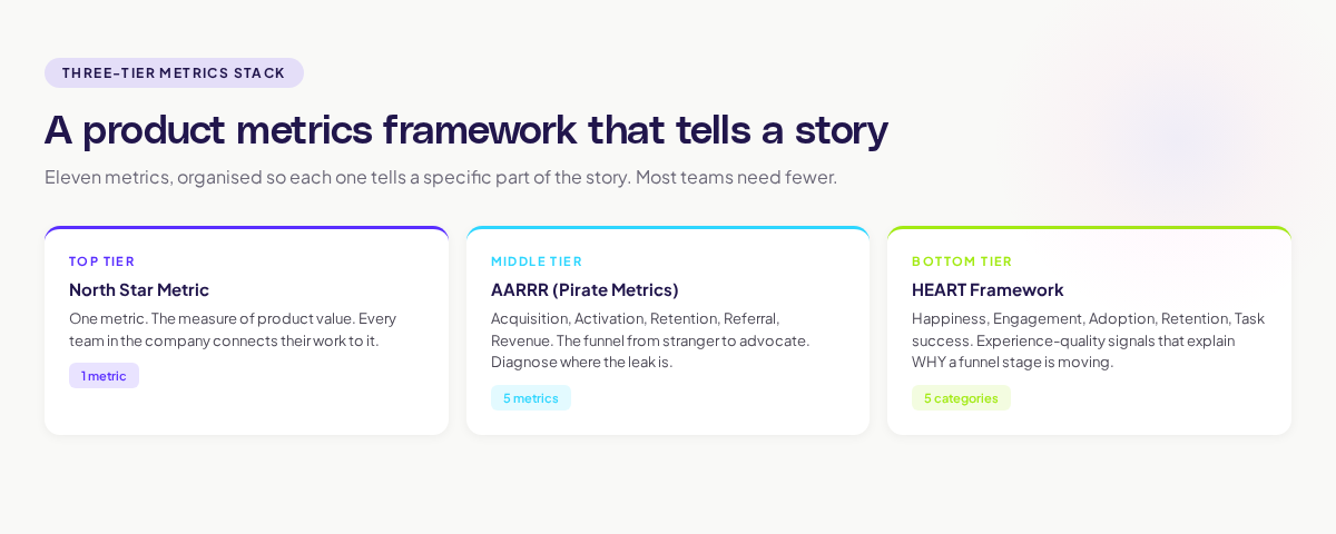
The three metric frameworks worth knowing
Three frameworks dominate modern product measurement. Each has a different job. Use them together, not as alternatives.
HEART: measuring user experience
The HEART framework was developed at Google by Kerry Rodden and colleagues. It maps experience quality onto five categories:
- Happiness — how users feel about the product (NPS, CSAT, survey)
- Engagement — how often and how deeply they use it (sessions, actions per session)
- Adoption — how many new users take on the product or a feature
- Retention — how many stay over time
- Task success — how often users complete what they set out to do
HEART's strength is that it forces you to ask "is the experience actually good?" separately from "are we hitting our business numbers?" A product can grow on marketing muscle for a year while the experience quietly decays. HEART surfaces that.
AARRR: measuring the funnel
AARRR, Dave McClure's "Pirate Metrics," is the classic growth funnel: Acquisition, Activation, Retention, Referral, Revenue. It maps the full journey from stranger to paying advocate, and it forces every team to have a clear answer for each stage.
AARRR's strength is comparability. Two very different products can be compared on the same five dimensions. It also surfaces where the leak is. If your Acquisition is fine but Activation is awful, no amount of extra marketing will save you.
North Star: the one number that matters
The North Star Metric, as Sean Ellis defined it, is the single metric that best captures the core value your product delivers. Airbnb's nights booked. Spotify's time spent listening. Slack's messages sent in active teams.
The North Star is not a replacement for HEART or AARRR. It sits above them. It's the one number everyone in the company rallies behind, and it gives leadership a shorthand for whether the product is winning.
Where journey intelligence changes the game
Metrics alone tell you what happened. They don't tell you why. This is where journey data earns its keep.
Every metric in the framework has a "what" and a "why."
Activation dropped from 28% to 23% (the what). Journey analysis shows that users who entered via a specific marketing campaign bounced on step 2 of setup at 3x the rate of organic users. The landing page copy set a different expectation than the setup flow delivered (the why).
Week 4 retention is strong at 48% (the what). Journey analysis shows users who create a second project in week 1 retain at 72% vs. 30% for single-project users. Doubling down on "second project creation" as an activation moment would lift retention overall (the why).
NPS dropped 6 points last quarter (the what). Replay clustering shows a spike in users getting stuck on a new permissions flow that shipped in month 2 of the quarter. The bug is in the UX, not the score (the why).
You can see why a metrics framework without journey visibility is only half useful. The numbers tell you something's moving. The journey tells you what to do about it.
Adora's approach to this is what we call AI journey mapping: models that automatically capture and visualise how users actually flow through the product, so every metric in the framework has a one-click path to "show me the journeys behind this number."
Choosing your North Star
If your team doesn't have a clear North Star yet, this is the section to spend time on. A bad one will misdirect a team for years.
A good North Star has three properties:
- It reflects actual value delivered. Not sign-ups. Not page views. Something that users would miss if it stopped. Airbnb's nights booked means "a stay happened, someone travelled." It would be felt if it dropped.
- It's leading, not lagging. Revenue is lagging. A pattern of usage that predicts revenue is leading. Leading metrics let you see trouble before it hits the P&L.
- The whole company can orient around it. If marketing, product, engineering, and support can all see how their work connects to the number, it's a good North Star. If only two teams can, it's probably too narrow.
If you're in an early-stage B2B SaaS, your North Star might be "weekly active teams above size X." For a creative tool, "projects completed per week." For a consumer subscription, "retained monthly subscribers."
The trick is that the right North Star is usually specific to your product in ways that generic advice can't tell you. Pick the thing that, if it doubled, would make the business clearly healthier. Pick the thing that, if it halved, would send the team into panic. That's usually close to the right choice.
Common mistakes teams make with product metrics
Tracking everything. A dashboard with 80 metrics is a dashboard nobody reads. Pick 10–15 core metrics and be ruthless about the rest.
Lagging metrics only. If all your metrics are revenue, churn, and MRR, you can only react after the damage is done. Always have leading metrics tied to behaviour.
Metrics without cohorts. An activation rate of 25% means different things for last month's cohort and the cohort from two years ago. Always look at metrics cohorted.
Nobody owns each metric. If more than one team owns a metric, nobody does. Assign each core metric to a single team that moves it.
Dashboards without context. A number in a dashboard is almost useless without two things: the trend, and the "why." Always pair a number with its direction and a link to the journey behind it.
How to roll out a metrics framework without the usual mess
If you're setting up a metrics framework from scratch, here's a sequence that works.
Week 1. Pick your North Star. Have the conversation with leadership. Get disagreement resolved on the page.
Week 2. Define your AARRR metrics. Agree on the exact event that counts for each. Write the definitions down.
Week 3. Layer in HEART. Pick one metric per category to start. You can add more later.
Week 4. Build the dashboard. Pair every metric with a journey link so a click drops the viewer into the user sessions behind the number.
Week 5. Run the first review. Go through each metric. For every number that's moved, name the journey evidence behind it. No "we think it's because..." answers. Evidence or question marks.
Ongoing. Review weekly at the team level, monthly at the exec level, quarterly at the strategy level. Retire any metric that hasn't driven a decision in a quarter.
Five weeks to a working framework. Most teams drag this out to six months because they get stuck debating definitions. Don't. Pick something reasonable. Launch it. Revise.
What "good" looks like
A team running this framework well looks like this:
- Everyone can name the North Star without looking it up.
- Every AARRR and HEART metric has a single team that owns it.
- Every weekly review pairs every moved number with a journey-level explanation.
- Metrics drive decisions. Each week, at least one number shifts how the team prioritises work.
- The dashboard is boring. Nothing in it is there for show. Everything has a job.
A team running it badly looks like this:
- Metrics are picked to make leadership feel good.
- Dashboards are full. Engagement with them is not.
- Weekly reviews are recitations. No decisions get made.
- When asked "why did activation drop?" the answer is "we're not sure."
What to do this week
Pick one.
- Write your North Star metric on a whiteboard. Ask three teammates to write theirs. If the four answers don't match, you have work to do.
- Pull the definitions of your current activation and retention metrics. If they're vague, sharpen them. Write the exact event sequence.
- Take the three metrics your team looks at most. For each, write a one-line "why" based on the journey behind it. If you can't, that metric is incomplete.
A framework is only as good as the decisions it produces. Start small, pair every metric with its journey evidence, and you'll spend less time in dashboard reviews and more time shipping things that actually move the business.
Related posts

Why We Built AI Product Insights
The story behind Adora's AI Insights, and why I think this is the future of how product teams operate.

Data-driven off a cliff: why dashboards are dead
Dashboards are dead. Not because data doesn't matter. But because the way we've been accessing it was never actually built for the people making product decisions. Here's what went wrong, and what comes next.

SaaS Pricing Pages to Sign Up Journeys
This teardown analyzes SaaS pricing pages and their connected sign up journeys. Learn how leading SaaS companies design pricing, CTAs, and sign up flows that reduce friction and increase conversion.