Customer Health Score: AI-Calculated Risk and Opportunity
A customer health score is only useful if it predicts what's about to happen. Here's how AI-calculated signals turn product usage into a real early-warning system for churn and expansion.


Customer health score: AI-calculated risk and opportunity
Most customer health scores are red, yellow, or green numbers nobody trusts.
You've seen the dashboard. A pile of accounts marked yellow that nobody acts on. A green account that churned anyway. A red account where the customer success manager swears the customer is fine. The score went up. The customer left. The score went down. The customer renewed.
The reason this happens is simple. Most health scores are built from rules a human picked once, weighted by gut feel, and rarely revisited. They look like rigour. They behave like superstition.
A modern customer health score works differently. It's calculated from real product behaviour, updated continuously, and it tells you not just which customers are at risk but exactly what's going wrong and what to do about it. Done well, it's the most leverage a growth or customer success team has.
This guide walks through what a customer health score actually is, why most of them fail, and how AI-calculated signals turn the score into something teams can act on.
What a customer health score really is
A customer health score is a single number that summarises how likely an account is to renew, expand, or churn. It rolls up multiple signals into one view so customer success and growth teams can see, at a glance, where to spend their time.
Gainsight, who has been building this category for over a decade, defines it as a predictive metric that consolidates inputs like product usage, support history, sentiment and engagement into a single signal. Most teams visualise the result as red, yellow, green, or as a 0 to 100 score.
The intent is right. A single number that predicts what's about to happen would be hugely valuable. The execution is where most teams come unstuck.
Why most customer health scores fail in practice
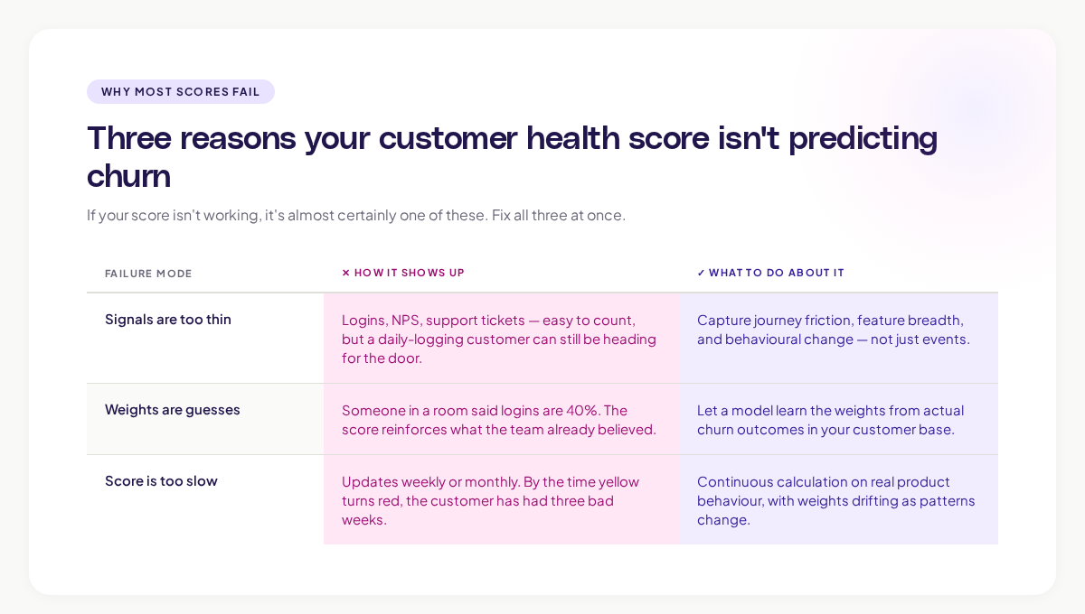
Three failure modes show up over and over. If your score isn't working, it's almost certainly one of these.
1. The signals are too few and too generic
A typical health score uses three or four signals: login frequency, feature adoption, support ticket count, and NPS. These signals are easy to count, but they capture almost none of what actually predicts churn.
A customer can log in every day and still be heading for the door. They can adopt the headline feature and still hate the product. They can give a 9 on NPS the week before they cancel. The signals sound right. They aren't.
The signals that actually predict churn are subtler. Where users spent time before they stopped. Which screens they tried to find but couldn't. Which paths users took the first time they got stuck. The traditional health score never sees these.
2. The weights are guesses
Most health scores are built by sitting in a room and asking, "How important do you think login frequency is?" Someone says 30%. Someone else says 50%. The team picks 40%, calls it a methodology, and moves on.
A weighting picked by gut feel becomes the truth of the score. If logins are 40% of the score, then a customer who logs in often will look healthy regardless of what else is happening. The score reinforces what the team already believed instead of revealing something new.
3. The score doesn't update fast enough
Most health scores update weekly. Some update monthly. By the time a yellow turns red, the customer has already had three bad weeks the team didn't notice.
A truly useful health score is calculated continuously, on real product behaviour, with the weights updated as new patterns emerge. That's not what most teams have.
What real signals of customer health look like
If you want a health score that predicts behaviour, you need to capture behaviour in detail. The signals worth tracking fall into four categories.
Product usage depth. Not just "did they log in" but how deeply they used the product. Which workflows did they complete? Which features did they touch? How does this week compare to their pattern over the last quarter?
Journey friction. Where users get stuck, abandon a workflow, or repeat the same step multiple times. A customer who's hitting friction is a customer thinking about leaving, even if they haven't said so.
Feature breadth and stickiness. Which combinations of features the customer uses tells you how embedded they are. A team using one feature is far easier to displace than a team using six. Gainsight's DEAR framework puts adoption and engagement at the centre of this for good reason.
Behavioural change. The most telling signal isn't the absolute number. It's the change. A customer who was logging in daily and is now logging in weekly is in a very different state, even if the weekly number still looks "healthy" by the rule.
The teams that get health scoring right look at all four. The teams that don't pick whichever is easiest to count.
Where AI changes the customer health score
The phrase "AI-calculated" gets thrown around for marketing reasons. In customer health scoring, it actually means something specific.
A traditional score is a hand-built formula with hand-weighted signals. An AI-calculated score uses machine learning to find the patterns of behaviour that historically preceded churn or expansion in your specific customer base. The model doesn't need a human to guess the weights. It learns them from what actually happened.
This shift changes three things.
The signals the model uses are not pre-decided. Instead of telling the model that logins matter, the model finds out for itself which behaviours correlate with churn for which segments. For an enterprise customer, the predictors might be admin activity and integration usage. For a self-serve customer, it might be onboarding completion and time to first value. Same product, different signals, all learned automatically.
The weights update continuously. As new churn events happen, the model retrains. The weights drift to match what's actually happening, not what was true a year ago. Gartner has noted that augmented analytics, which encompasses this kind of automated weighting, is moving from emerging to mainstream as more teams discover the limits of hand-built rules.
The output is interpretable. A good AI health score doesn't just give you a number. It tells you which signals drove the score. "This account dropped from 80 to 50 because admin logins fell 60% and three users hit errors in the data export workflow." That's actionable. A bare red flag isn't.
Building a customer health score that works
If you're starting from scratch, or rebuilding one that isn't working, here's the order of operations that consistently produces a usable score.
Step 1: Define what "healthy" means for your business
Before you pick signals, decide what the score is predicting. Is it renewal? Expansion? Net retention? Activation in the first 90 days? Each of these is a different model.
KeyBanc Capital Markets, in their annual SaaS survey, found that gross retention declined to 86% across private SaaS companies, while net retention stayed above 100%. The teams holding net retention up are the ones who treat expansion and churn as separate questions, with separate scoring.
Step 2: Capture product behaviour at the journey level
You can only score on what you can measure. If your data is just events and dashboards, you'll get an event-and-dashboard health score. If you can capture the full path users take through your product, you can build a far richer signal.
This is part of why visual journey data matters here. At Adora, our Journey Maps and Signals give customer success and growth teams the granular behaviour data a real health score needs. You're not just counting events. You're seeing the patterns of behaviour that precede churn and renewal, on every account.
Step 3: Train the model on your actual outcomes
Pull your last 18 months of data. Tag the accounts that churned, expanded, downgraded, and renewed. Let the model find the behavioural signals that distinguish those outcomes. Don't tell it what to look at. Let it tell you.
The patterns it surfaces will sometimes surprise you. A pattern that customer success swore was a churn predictor turns out to be neutral. A pattern nobody was tracking turns out to be the strongest signal. This is the point of using AI here. The score gets honest.
Step 4: Make the score interpretable, not just predictive
A score that says "70" with no explanation is unusable. A score that says "70, down 15 points this week, driven by a 40% drop in admin activity and three new support tickets" is workable. Build the interpretability in from the start. The customer success team needs to know why the number moved.
Step 5: Wire the score into the team's workflow
The best health score in the world is useless if nobody opens it. Build it into the daily standup. Trigger Slack alerts when a key account drops below a threshold. Auto-create tasks for at-risk accounts. The score should pull people to the right work, not sit waiting for someone to check the dashboard.
What to avoid
A few patterns kill an AI customer health score before it gets traction.
Over-fitting to historical churn. If your model is too tightly tuned to past churn events, it will miss new patterns. Build in a mechanism to surface unusual behaviour, not just behaviour that matches the past.
Hiding the score from customers. Some teams treat the health score as internal-only intelligence. The teams that get more value out of it share at least the high-level signal with the customer. "We've noticed your team's admin usage has dropped this month, want help?" lands differently than waiting until someone churns.
Treating the score as a single number for every customer. Different customer segments have different healthy patterns. A single global score for all customers will mask the truth. Segment the model: enterprise versus self-serve, new versus mature, technical versus non-technical. Each gets its own version.
Confusing predictive with prescriptive. A health score predicts what's likely to happen. It doesn't tell you what to do about it. The team still needs to bring judgement, taste, and context. The score is a starting point for the conversation, not a substitute for one.
The real test of whether a customer health score is working
Three questions tell you honestly whether your score is doing its job.
- When a key account churned in the last six months, did the score predict it at least 30 days in advance?
- Can a customer success manager look at the score and explain in one sentence why it changed?
- Does the team actually use the score to prioritise their week, or do they fall back on gut feel and last-touched dates?
If you can't answer the first, the score isn't predictive. If you can't answer the second, it isn't interpretable. If you can't answer the third, it isn't useful.
A working score answers all three. It surfaces risk early enough to act. It explains itself. It changes how the team spends its time.
Where this is going
The next two years will see customer health scoring move in the same direction product analytics already has: from event-based dashboards to journey-aware, AI-calculated, continuously updating intelligence. ChartMogul's SaaS retention report flags the fundamentals haven't changed: retention is what makes or breaks the business. What's changing is how fast teams can see what's happening and act on it.
The teams getting ahead are the ones who treat the customer health score not as a customer success tool, but as a product, growth, and retention shared truth. Product sees which features keep customers healthy. Growth sees where to invest in retention. Customer success sees who needs them most. All three are looking at the same number, with the same evidence underneath it.
That's the version worth building. The red-yellow-green dashboard from 2018 isn't.
What to do this week
Three small moves, in order of impact.
- Pull your last 12 months of churn. Tag each lost customer with what their health score said 30 days before they left. If the score wasn't accurate, you have your starting point.
- List the top five signals your current score uses. Ask: "If a customer scored highly on each of these signals but was unhappy, would the score know?" If the honest answer is no, the signal set is too thin.
- Pick one segment (say, enterprise customers) and build a small AI-calculated score on just that segment using your last 18 months of data. See whether the model finds different signals than your hand-built rule.
A health score that predicts what's coming, and explains itself, is one of the most valuable assets a SaaS business can build. It's worth getting right.
Related posts

Why We Built AI Product Insights
The story behind Adora's AI Insights, and why I think this is the future of how product teams operate.

Data-driven off a cliff: why dashboards are dead
Dashboards are dead. Not because data doesn't matter. But because the way we've been accessing it was never actually built for the people making product decisions. Here's what went wrong, and what comes next.

SaaS Pricing Pages to Sign Up Journeys
This teardown analyzes SaaS pricing pages and their connected sign up journeys. Learn how leading SaaS companies design pricing, CTAs, and sign up flows that reduce friction and increase conversion.