AI reporting tools: auto-generate product reports that get read
AI reporting tools promise to turn raw product data into polished reports in minutes. Some deliver. Some don't. Here's how to tell the difference, and how to use the good ones without losing the thread.

AI reporting tools: auto-generate product reports that get read
The product report problem is universal. Someone needs the weekly update. Someone else needs the monthly review. Leadership wants the quarterly. Every one of these takes hours of pulling data, formatting charts, writing summaries, and sending it off, only to find half the recipients skim the first paragraph.
AI reporting tools are the obvious fix. Take the raw data, generate the report, share it. Done. The catch is that the gap between "generates a report" and "generates a report worth reading" is wider than the marketing implies.
This is for product managers, ops leads, and team leads who'd rather spend their time on decisions than on assembling slides.
What AI reporting tools actually do
The category covers a lot of ground. At the simplest level, an AI reporting tool takes structured data and produces a written summary with charts. At the more useful level, it does that and explains what the numbers mean, flags what's worth attention, and adapts the format to the audience.
The mechanics are straightforward: large language models read your data, draft text, and an automation layer connects the data sources, schedules the runs, and pushes the output where it needs to go.
Forrester's research on AI in knowledge work found that a single AI search and reporting tool can save individual users 5 to 6 hours per week. For product teams, those hours usually go directly into the work that creates the data, not the work that describes it.
Why most product reports waste time
Three problems show up across almost every team.
The first is repetition. The same chart, the same KPIs, the same week-over-week comparison, every Monday. Humans are doing assembly work that machines should handle.
The second is format-first thinking. The team starts with the slide template and stuffs whatever data they have into it. The audience gets a polished document with no actual signal in it.
The third is summarisation drift. Someone writes a summary on Monday, someone else copies it on Tuesday, by Friday the original meaning has shifted three times. Nobody remembers what the data actually said.
Good AI reporting tools fix the first problem cleanly. They can fix the second if you set them up right. They make the third one worse if you don't.
What the good AI reporting tools have in common
Not every tool is useful. The ones that earn their keep tend to share a few traits.
They write in your team's voice, not a generic one. A report that reads like every other AI report gets ignored after week three. The tool needs to either let you set tone or learn from feedback. If every paragraph starts with "In this report we will analyse...," kill it.
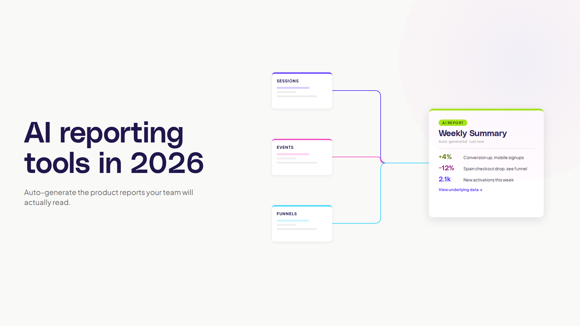
They explain, not just describe. "Conversion is up 4%" is description. "Conversion is up 4% because activation in the new flow is 12% better, and the segment driving it is mobile signups from search ads" is explanation. The second is useful, the first is filler.
They flag what matters and skip what doesn't. A report that includes every metric every week trains the audience to skim. A report that says "this week's standout: drop in Spain conversion, here's why" gets read.
They link back to the underlying data. If a number is interesting, the reader should be able to click through and see the chart, the cohort, the sessions. Reports without click-through become end-of-the-line documents that no one trusts enough to act on.
They run on a schedule and adapt to interruptions. Anyone can write Monday's report. The good tools handle the week the data pipeline broke, the holiday, the weird release day, without producing nonsense.
Where AI reporting tools fall short
The honest gaps.
Anything that requires real judgement. "Should we ship this feature next sprint?" is not a reporting question. The AI can summarise the data, it can't make the decision. Treat the report as input, not output.
Long-form narrative. A weekly summary is fine. A six-page strategic narrative argued from first principles is something a human still needs to write. The AI helps with the data sections inside it, not the argument.
Anything tied to a hypothesis nobody told the AI about. If the team is testing whether new pricing improves expansion revenue, but the report is configured to summarise activation, the report will look fine and miss the actual question. AI reports inherit the questions you set up. They don't generate the right questions on their own.
Nielsen Norman Group's research on AI in UX makes the broader point: AI tools are good at speeding up well-framed work and poor at framing work in the first place. The same is true here.
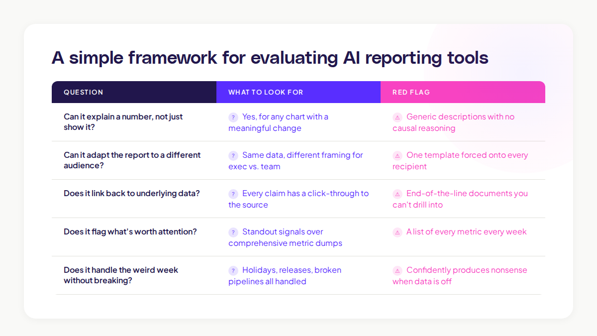
A simple framework for evaluating AI reporting tools
If you're picking a tool, run it past these five questions with your real data, not a demo.
Question
What to look for
Can it explain a number, not just show it?
Yes for any chart with a meaningful change
Can it adapt the report to a different audience?
Same data, different framing for exec vs team
Does it link back to underlying data?
Every claim has a click-through
Does it flag what's worth attention?
Don't get a list of every metric
Does it handle the weird week without breaking?
Holiday, release, broken pipeline, all handled
A tool that handles four out of five is probably worth using. A tool that handles two is just a slow chart generator with extra steps.
How AI reporting tools change the team's rhythm
The shift goes deeper than time saved. When the report writes itself, three things change.
Reports get more frequent and shorter. A weekly report that takes 90 minutes to write becomes a daily summary that takes ten seconds to read. The cadence tightens, the team catches problems faster.
Recipients get more discerning. When the cost of producing a report drops, only the useful ones survive. The team naturally trims the ones nobody actually needs.
The data team's role moves up. Less time spent on assembly, more time spent on the harder questions: what should we be measuring, what does this trend mean, what experiment should we run next.
McKinsey's State of AI 2024 survey found that the highest value comes when teams use AI to free up expertise for the higher-leverage work, not when they use it to do the same things faster. Reports are a clear case.
How this works inside Adora
The cleanest version of AI reporting in product analytics doesn't look like a separate reporting tool. It looks like the reporting being baked into where you already work.
Adora's Ask Adora handles the question-and-answer side of this. You ask, you get the chart, you get the explanation. The report is the conversation thread, not a separate document.
For the recurring stuff, AI Insights flags the patterns worth your attention this week without being asked. The "report" becomes a short list of things to look at, each linked to the underlying journey, session, or screen.
The combination removes the gap between "we have a report" and "we know what to do." Both are surfaced together, in the same place, by the team that owns the work.
A short rollout pattern that works
If you're thinking about adding AI reporting to your stack, the rollout below tends to work.
Step 1: Pick the most-skipped recurring report. The one that takes the longest to assemble and gets the least engagement. That's your test case.
Step 2: Replace it with an AI-generated version, but read every output for two weeks. Don't trust the output blindly. Edit, correct, retrain. After two weeks you'll know what the tool gets right and where it slips.
Step 3: Move the people who used to write it onto the next problem. This is the real win. The hours saved get reinvested into work the AI can't do, like deciding what to ship next.
Step 4: Expand only when the first report has been working for a month. Don't roll it out to ten reports on day one. Earned adoption beats announced adoption.
Common mistakes with AI reporting tools
Three to watch for.
Mistake 1: Treating the AI report as the final word. Always read it before sending. AI confidently states wrong things. The reader doesn't know which sentence to trust unless you've already filtered.
Mistake 2: Using it for too many audiences with one template. Exec, team, and customer reports need different framings. Most tools can adapt if you set them up to. Few do it by default.
Mistake 3: Letting the report replace the conversation. A weekly written summary is not the same as a five-minute team check-in. The report informs the conversation, it doesn't substitute for it.
The teams that get the most from AI reporting tools are the ones treating them like a junior analyst: useful, fast, capable of producing good drafts, but not the final voice.
Where to start
If you read this far and want to test an AI reporting tool, do one thing this week. Pick the report that feels most assembly-line in your week. Run a single iteration through an AI tool with your real data. Compare it side by side with the human version.
If the AI version captures 80% of the signal and you can fix the rest in two minutes, you've found the unlock. If it's missing the things that matter, you've still learned something useful: the gap is in the data setup, not the report layer.
Either way, your Friday gets a little easier. That's the real test.
Related posts

Why We Built AI Product Insights
The story behind Adora's AI Insights, and why I think this is the future of how product teams operate.

Data-driven off a cliff: why dashboards are dead
Dashboards are dead. Not because data doesn't matter. But because the way we've been accessing it was never actually built for the people making product decisions. Here's what went wrong, and what comes next.

SaaS Pricing Pages to Sign Up Journeys
This teardown analyzes SaaS pricing pages and their connected sign up journeys. Learn how leading SaaS companies design pricing, CTAs, and sign up flows that reduce friction and increase conversion.