A/B testing ideas: how to run growth experiments that work
Most A/B testing backlogs are full of vague ideas that never ship. Here are 12 growth experiments worth running, the patterns that surface them, and how to know which one to start with this week.


A/B testing ideas: how to run growth experiments that work
You don't have an A/B testing problem. You have an A/B testing ideas problem.
Most growth teams have the tooling. They've got Optimizely or VWO or a homegrown feature flag system. What they don't have is a steady pipeline of experiments worth running. The backlog fills up with "test the button colour" and stays there. Six months later, the team can't point to a single test that moved a metric anyone cares about.
This guide is about closing that gap. You'll get 12 A/B testing ideas that actually move retention, activation, and revenue, the patterns that surface them in your product, and a way to prioritise which one to run first.
Why most A/B test backlogs are full of bad ideas
The pattern is consistent across teams. Someone has a hunch. They write it as a Jira ticket: "Test new homepage hero." It sits there for weeks. Eventually it gets shipped, the result is inconclusive, and the team learns nothing.
The root cause is usually one of three things.
The hypothesis is missing. "Test the hero" is not a hypothesis. "If we replace the abstract illustration with a product screenshot, we expect activation to rise by 5% because users will understand what we do faster" is a hypothesis. One of these can be tested. The other can't. Booking.com runs roughly 25,000 experiments a year, and they've documented why they require a hypothesis on every test, not just an idea, in a VWO breakdown of their CRO culture. The discipline is the difference between learning and noise.
The test isn't tied to a goal. If a test passes, what changes about the business? If you can't answer that in one sentence, the test isn't worth running.
The test is too small to matter or too big to ship. Tests that move 0.1% of a metric won't reach significance. Tests that change six things at once can't tell you which change worked.
A good A/B testing idea solves all three. It has a hypothesis, a clear metric, and a single change you can attribute the result to.
How to spot the next test in your product
Before we get to the 12 ideas, here's the pattern that surfaces them. Good experiments come from one of four sources.
1. Drop-off points in your funnel. Wherever users leave is a candidate. If 41% of users drop at "create your first project," that step is the most valuable place to experiment.
2. Frustration signals. Rage clicks, repeated form submissions, sudden session ends. These are the user telling you, without words, that something isn't working.
3. Support tickets and user research themes. If three users this week asked the same question, the product is the wrong place to need an answer. That's a test idea.
4. Strong external evidence. Sometimes the best ideas come from outside. Baymard Institute's research on cart abandonment, for example, has documented that extra costs are cited by 48% of shoppers as the reason they abandon checkout, alongside other consistent patterns. Their findings are in Baymard's cart abandonment statistics. If your data shows the same pattern, you can borrow the test.
The evidence loop is what separates a real A/B test from a wild guess. Without it, you're running experiments in the dark.
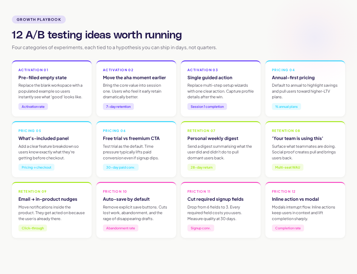
12 A/B testing ideas worth running
Here are 12 experiments grouped by where they live in the user journey. Each one has a hypothesis structure you can adapt.
Activation and onboarding
1. Replace the empty state with a pre-filled example.
Hypothesis: when new users land on an empty workspace, showing a populated example will reduce time-to-first-action because they'll see what "good" looks like.
Metric: activation rate within first 24 hours.
2. Move the "aha moment" feature earlier in onboarding.
Hypothesis: users who experience the core value in their first session retain better than users who wait three sessions to find it.
Metric: 7-day retention.
3. Replace a multi-step setup wizard with a single guided action.
Hypothesis: forcing a complete profile delays the first win. Letting users do the core action and capturing details later will improve activation.
Metric: percentage of new users who complete the core action in session 1.
Pricing and conversion
4. Test annual-first vs. monthly-first pricing display.
Hypothesis: showing annual pricing as the default highlights the savings and shifts users toward higher-LTV plans.
Metric: percentage of paid users on annual plans.
5. Add a "what's included" panel to the pricing page.
Hypothesis: users who don't convert often leave because they don't know what they're getting. A clear feature breakdown reduces drop-off.
Metric: conversion rate from pricing page to checkout.
6. Test a free trial vs. a freemium plan as the default CTA.
Hypothesis: free trial users convert at higher rates than freemium users because of the time pressure, even if signup is lower.
Metric: paid conversion within 30 days of signup.
The Bing example documented in Harvard Business Review is worth keeping in mind here. A small change to how ad headlines were displayed produced a 12% revenue lift, worth more than $100 million annually. The full case is in the surprising power of online experiments. Tiny changes, properly tested, can produce outsized results.
Engagement and retention
7. Add a personal weekly digest email.
Hypothesis: a digest summarising what the user did and didn't do will pull dormant users back into the product.
Metric: 28-day return rate.
8. Test a "your team is using this" social proof banner.
Hypothesis: showing what teammates are doing creates pull. Users return to see what they missed.
Metric: weekly active users among multi-seat accounts.
9. Move notifications from email to in-product.
Hypothesis: email notifications are easy to ignore. In-product notifications get acted on because the user is already in the tool.
Metric: notification click-through rate and follow-up action.
Friction reduction
10. Auto-save instead of explicit save buttons.
Hypothesis: users lose work when they forget to save. Removing the save action and auto-saving will reduce frustration and abandoned sessions.
Metric: session abandonment rate.
11. Reduce required fields on the signup form.
Hypothesis: every required field costs you users. Cutting from 6 fields to 3 will improve signup conversion without hurting lead quality.
Metric: signup conversion and lead quality measured by 30-day activation.
12. Replace the modal with an inline action.
Hypothesis: modal interruptions break flow. Inline actions keep the user in context and improve completion.
Metric: completion rate of the action; session time before drop-off.
Prioritising your test backlog
Twelve ideas is a lot. You can't run all of them at once. Here's a simple way to prioritise.
For each idea, score:
- Impact: if the test wins by the expected amount, how much business value does that create? (Low / Medium / High)
- Confidence: how strong is the evidence that this will work? (Hunch / Some signal / Strong signal)
- Effort: how many engineering days does it take to ship the variant? (1-3 / 4-7 / 8+)
The classic ICE or PIE scoring frameworks work fine here. The goal isn't precision. It's surfacing the tests that have a real chance of moving the metric and aren't going to take a quarter to ship. Pick the top three. Run them.
What kills good A/B tests
Even with great ideas, plenty of tests fail to produce useful results. Watch for these patterns.
Underpowered tests. If you don't have enough traffic to reach significance, the test is a coin flip. Use a sample size calculator before you start. The team behind Booking.com's experimentation programme has been clear that volume matters; their scale is what makes their tests trustworthy.
Cherry-picked metrics. If a test wins on one metric but loses on three others, the team will be tempted to call it a win. Define your primary metric before the test. Stick to it.
Stopping early. A test that looks like it's winning at day 3 might not be winning at day 14. Run for the planned duration. The Harvard Business Review piece on building a culture of experimentation covers this discipline in detail. The teams that win consistently are the ones that resist the urge to stop early.
Confounding variables. If you launched a marketing campaign in the middle of the test, you don't know what moved the metric. Hold variables steady or wait.
The role of journey data in better experiments
The fastest way to surface high-quality A/B testing ideas is to look at where users actually struggle. Reading session data, watching journey maps with friction overlays, and connecting drop-off points back to specific UI moments is what generates testable hypotheses.
If you're spending half your test design time stitching together exports from three tools, you're slowing down. Adora's approach connects journey maps with live behaviour data and friction signals so the next test idea is visible on the screen, not buried in a spreadsheet. Read more in our guide to funnel optimization with AI journey analytics.
The point isn't to run more tests. It's to run tests that come from real user behaviour and that move the metrics tied to your goals. That's how A/B testing stops being theatre and starts being a growth lever.
Where to go next
To go deeper on running better experiments, two adjacent reads are worth your time:
- The conversion funnel analysis guide covers how to spot the highest-value test ideas in your funnel.
- The user behavior analytics guide covers the signals you should watch in any experiment.
Run fewer, sharper tests. Tie each one to a goal. Use real user behaviour as your idea generator. That's the loop that turns A/B testing from a backlog of guesses into a growth engine.
Related posts

Why We Built AI Product Insights
The story behind Adora's AI Insights, and why I think this is the future of how product teams operate.
Data-driven off a cliff: why dashboards are dead
Dashboards are dead. Not because data doesn't matter. But because the way we've been accessing it was never actually built for the people making product decisions. Here's what went wrong, and what comes next.

SaaS Pricing Pages to Sign Up Journeys
This teardown analyzes SaaS pricing pages and their connected sign up journeys. Learn how leading SaaS companies design pricing, CTAs, and sign up flows that reduce friction and increase conversion.